Thesis Show
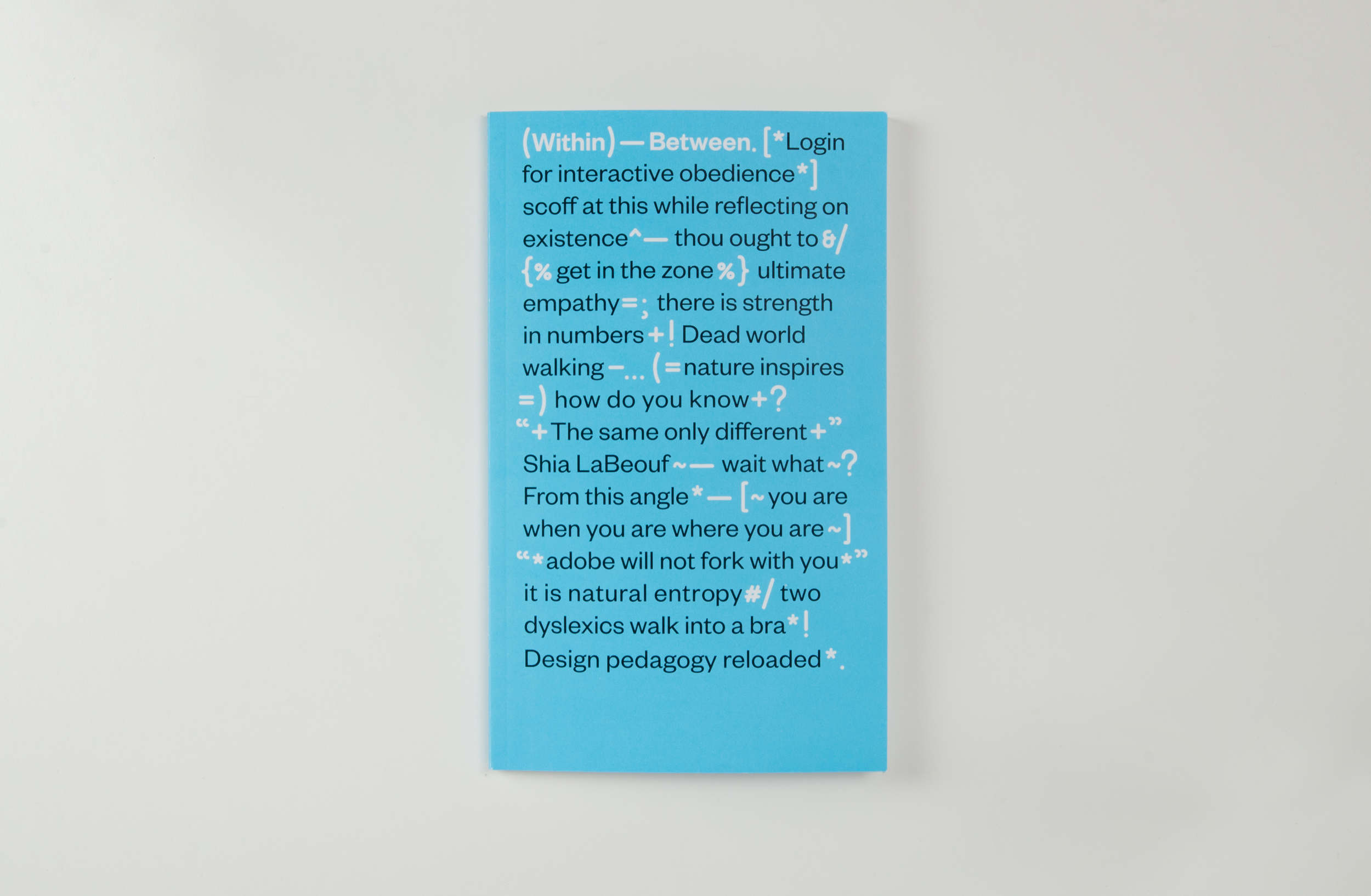
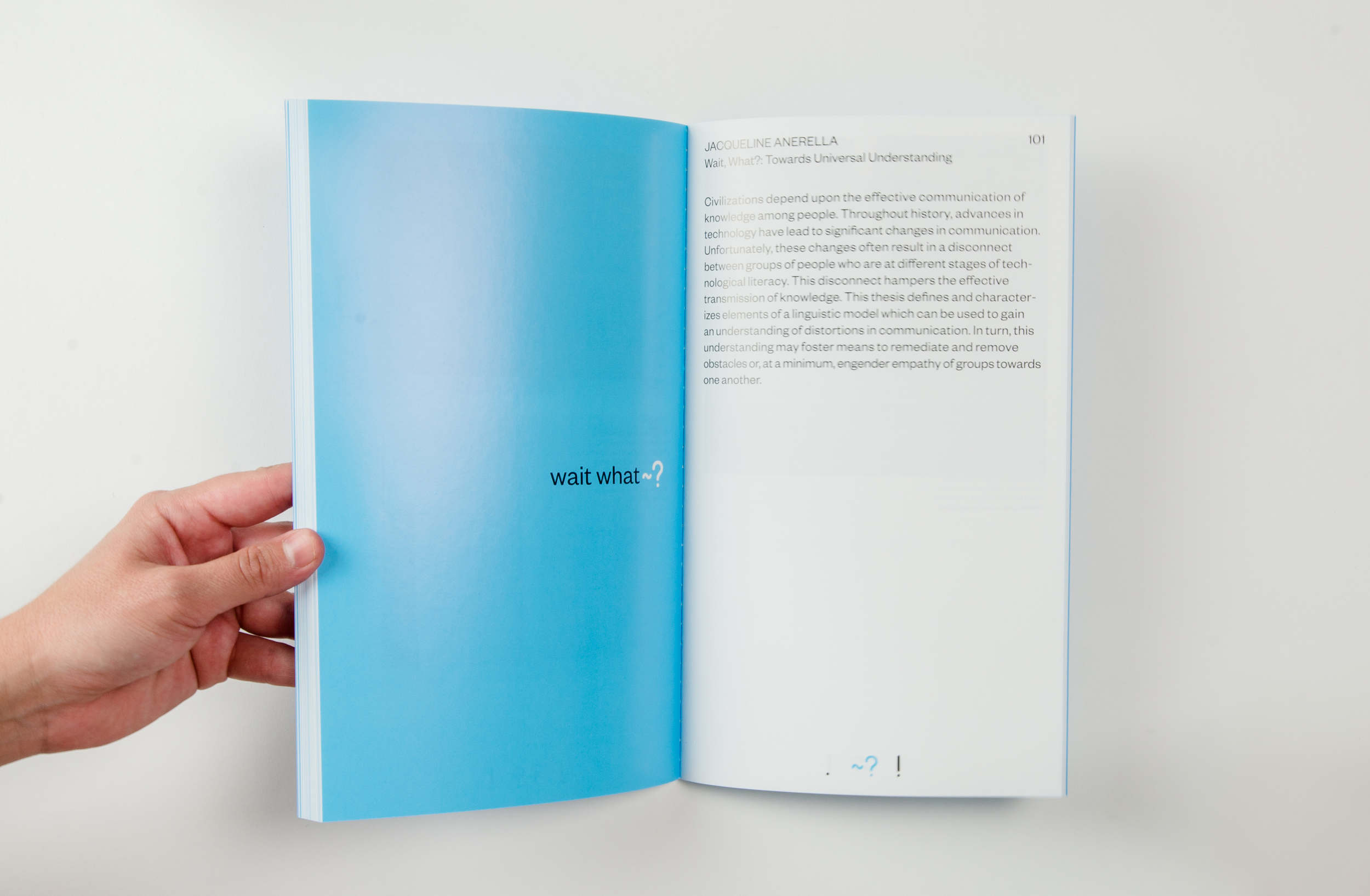
Punctuation marks serve to clarify relationships between words and sentences. Symbols are representative of materials and concepts, especially ones that are abstract. The 2016 Pratt Graduate Communications Design MFA thesis exhibition, (Within)—Between., highlights the process of drawing abstract relationships between eighteen distinct points of view.
As the position of design in contemporary society becomes increasingly multi-dimensional—blurring the boundaries between what constitutes design as a format, a process and a discipline—the designer is left to clarify their own parameters. In turn, such disparate ideas and approaches inflict a desire to draw connections. The collection of thesis investigations presented in this year’s exhibition follow no underlying theme, other than what lies in the transitions—within and between designers’ research topics; within and between the gallery and the outside world; within and between the individual designer and a larger public; and within and between an MFA program and the continuation of a design practice.
As members of Exhibition Design, my team was responsible for organizing the look and feel of the exhibition space. As a group, we decided to use the main gallery as an introduction to what would be seen inside the gallery rooms where projects were displayed. We used the design of this space to enhance the more poetic nature of the overall concept and allowed the gallery rooms to maintain the more technical aspects of the individual works themselves. Thesis books were displayed in front of the class statement on tables that were representative of the punctuation used in our exhibition name, (Within)—Between..
The gallery rooms were organized by individual punctuation; if students whose punctuations were beginning, middle or end were placed in their respective room.
http://wb.prattgradcomd.com/


